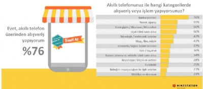
* According to FV 2015 MR Technology Report,
MS Powerpoint® is the most commonly used method to share research results with 55%.

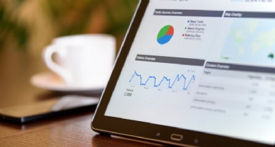
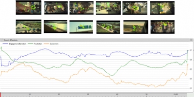
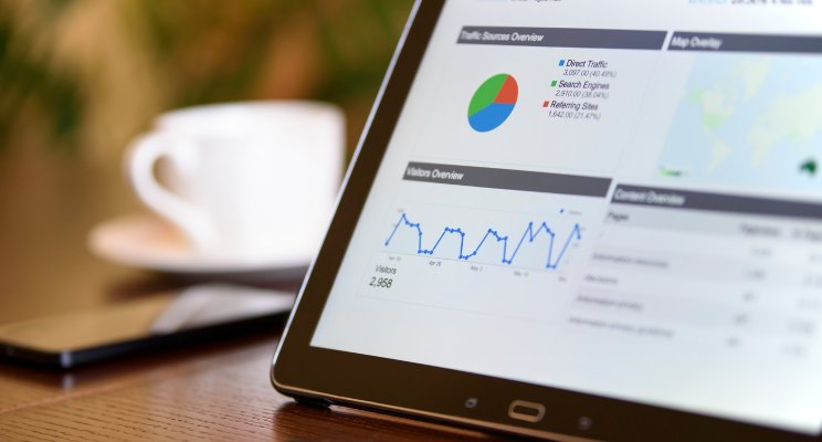
#1 Interactive Dashboards
Interactive dashboards visually share the most
important information for one or more projects with users. It is used in order
to follow results on a single page quickly and easily. By changing the
parameters like period, province, person, region, dealer etc., you can
instantly update all the information and investigate the results. Dashboards
are a great tool for managers, who are willing to use time effectively, to control
data for a project at any time. Dashboards, which are mostly preferred for
long-running projects, can be created more and more easily with various tools. I
would like you to introduce a few of them that I have experienced before.
E-tabs
E-tabs, one of the most established players in
the industry, develops software to automate research data and present it
visually to users. With "Market Research Dashboards"
you can create dashboards for your project using HTML5 and Silverlight
technologies. e-tabs.com
Dapresy
Dapresy offers a structure that enables online
reporting of research data and fully customizable visuals for the needs of your
customers. Dapresy, using HTML5 and .NET technologies, is the most powerful
player among similar software. It customizes the design based on your needs.
You can upload your SPSS® data file directly to the system and create your own
visual template and reports. It is especially useful for tracking projects. You
can transfer your reports directly to Powerpoint®. Obviously, Dapresy is my
favorite practice among the others. Here you can watch the video about how to
create the indicator panels. dapresy.com
#2 Online Presentation Technologies
We all want to make our presentation
clearer and more memorable. You can present your research results more
impressively with online / offline tools which are alternative to MS
Powerpoint®.
Prezi
Established
in 2009, Prezi has enjoyed a great deal of interest in the following years. Prezi's
online vector-based online editor is an exciting tool for those looking for
alternatives to Powerpoint®. Prezi, used by Chris Anderson for his
presentation at TED Global 2010, has been very popular over the years. Prezi
allows users to navigate as they would like in their presentations, zoom in to
dive in desired details and zoom out to minimize details to see the big
picture. You can add videos, pictures and music to enrich the presentations that
you create. With Prezi Pro, you can download your presentations to your computers
as offline. prezi.com
#3 Infographic
- Information graphics
Information graphics are graphical visual representations of information or data intended to present information quickly and clearly. [1] The sharing of market research data visually on a single page ensures that the results are perceived as much more comfortable. Even though, it required a graphic designer in the beginning, it makes our life easier thanks to rapid development of info graphical creation tools in recent years.
Information graphics are graphical visual representations of information or data intended to present information quickly and clearly. [1] The sharing of market research data visually on a single page ensures that the results are perceived as much more comfortable. Even though, it required a graphic designer in the beginning, it makes our life easier thanks to rapid development of info graphical creation tools in recent years.
Venngage
With over 300 ready-made templates, you
can easily create your infographics using the drag-and-drop method. With the paid version
you can share the infographics you prepared with the logos of your company. I
especially recommend you to check the ready-made templates at https://venngage.com/templates/#surveys where
you can share research results. I also would like to mention that they have a
very fast support line.
Piktochart
The most popular infographic application
Piktochart offers you over 600 templates. Up to now, more than 18 million
infographics have been created on the platform, indicating that it deserves
this title. Pricing is more reasonable compare to its competitors. You can also
design wonderful infographics to share your research results with Piktochart.
Infogr.am
Infogr.am is not only a creation tool,
but also an interactive report preparation tool. The infographics you have prepared
actually have an interactive dashboard feature. In this way, you can present
your data in more detailed and different ways. You can also translate it into
PNG and PDF formats. Obviously, using this tool alone, you can present your
research results fast, visual and in a single page. I would recommend you to
review this sample report of Infogr.am, my favorite application. As a developer
I can say the REST API is also an admiration.
#4
Motiongraphic - Animated chart
Briefly,
Motiongraphic is presenting the animated graphics in a stream of designs. This
approach, which means "hareketli grafik" in Turkish, is a video art
that allows the promotion of products or services to be perceived more easily
and quickly. You will need a professional designer and an advertiser to present
your research results with MotionGraph. But if you insist on to create
MotionGraphics, then it would be useful to talk about PowToon.
PowToon
PowToon provides you to create MotionGraphics
easily, quickly and effectively by its templates. PowToon also provides you templates
for your research results. Click here to customize the template you need and
share your results in an impressive way. You can save motion graphics you have
created in PDF or PPT format. To start creating your own animated graphic file
with platform guidance without any design or video preparation knowledge, visit PowToon.com
What is your idea for the 5th way?
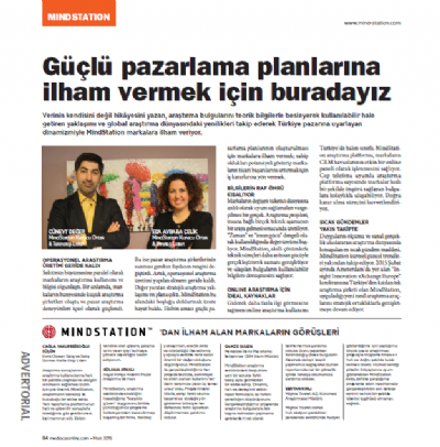
Cüneyt Değer